 Cherry Pie sell their stamps as unmounteds, I love to use unmounted rubber stamps as you can squeeze so many more stamps in your storage space! I tend to trim my Ums very close to the raised rubber die, and when Im stamping with them I use a clear acrylic mounting systems and cheap double sided tape to affix them. One of the main advantages of using these kind of mounts is that you can see EXACTLY where you are stamping on your surface.
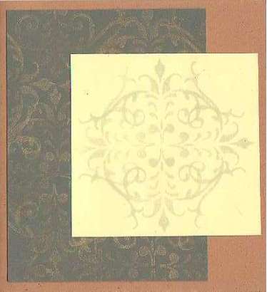
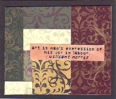
 It was with these clear blocks and careful spositiong and stamping of the Cherry Pie Border image that I realied I could repeat stamp the image over and over to create a patterned background. I experimented by stamping different colour inks on different colour surfaces to create different effects and styles. Once i had stamped the backgrounds they put me in mind of Wallpaper patterns! In particular the wallpaper and fabric patterns of artist William Morris! So I used William Morris as my inspiration for this project. I did a search on google and realised that William Morris was also a poet! Perfect for this issues theme of 'Poetry and Prose'! I collected a few random favourite quotes, printed them off, added colour and used them as center peices on my art. Read on for details....
Directions
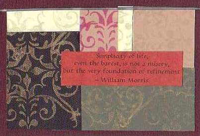
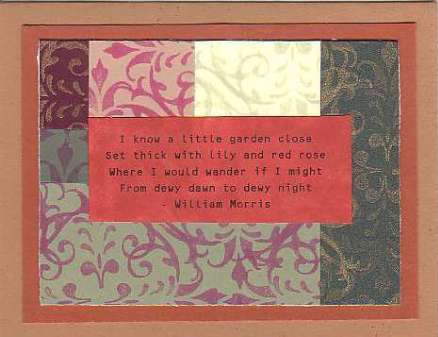
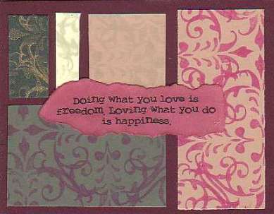
1. For these cards I used Burgundy, Tan, Sand, Black, Sage, Cream and Forest Green card stock. I wanted card colours which complimented each other and worked well together. The colours chosen are very victorian in style...I have a passion for that era!
Onto the black, forest green and burgundy card stock I repeat stamped the image to make up the pattern using the gold Brilliance inkpad.
Onto the cream and tan colour card stock I used Soft Leaf ink, on the sage card stock I used Port Red inkpad, and finally on the sand card stock I used black ink.
2. Once all the backgrounds are stamped; use a paper trimmer to cut up the background into different sized sections. You want them to be different shapes.
3. Afiix sections; use different colours next to each other onto a sheet of white card stock using double sided tape. Choose colours which contrast agaisnt each other when layering.
4. Trim card stock, and layer onto matching card stock, then finally onto card blank.
5. Print art quotes onto white paper, apply inks dtp onto the quotes, then either tear or trim around the quote. Affix to the front of your card using double sided tape.
Your card is complete.
Art and Words By Trish Bayley 2004 |